
Cartography Color Study
Color · Data Stories · Cartography
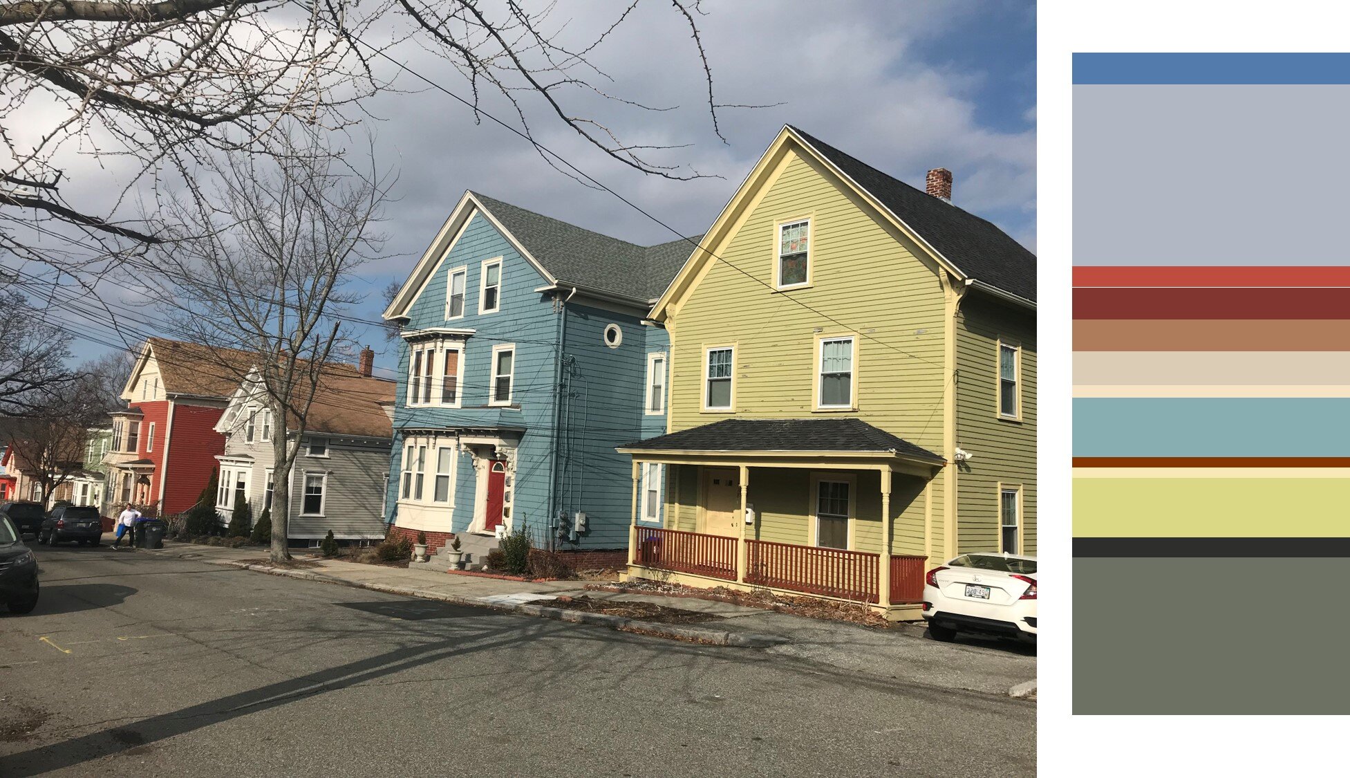
Concept: Color palettes developed from identical photos at different times of day emphasize the moods created by light.
Design Objectives: Color can be used to highlight different stories in map-making. Here, saturated colors are used to highlight areas of increased human pressure on the environment, using zoning data. All maps rely on neutral greys and greens to recede areas of low-density human pressure. Beautiful color palettes invite exploration of development and septic system pressure, a decidedly un-sexy topic.
Here, the eye is drawn primarily to areas of commercial development (deep reds).
Commercial and higher density residential development are prominent in this story. The blue lends the latter a positive connotation.
Business and higher density residential development are key players in this story. The steel grey lends the latter more ominous connotation.
Morning

Midday
Evening
